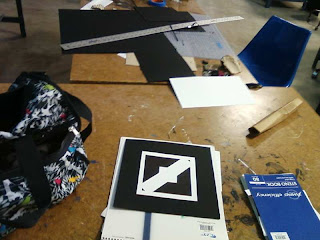
Process of making the finals

This project went much faster than dotdotdot, then again I learned to ease up on perfecting the prelimenary pictures. However there was one piece in particular that I spent a great time messing with; The "bird" was something I absolutely wanted to use as my final. Though I had other pieces that communicated playful quite well, I thought creating something out of the squares would be very playful and creative. I approached it like a young child building things out of blocks, playfully trying to make it look like an animal.
Self-crit:
8
- My craft went down compared to the dotdotdot assignment. I'm not sure if this is a good or bad thing however. I did get alot more done faster and had more time to tweek and experiment for the finals. I think if I had cared too much about the craft of the 8 that I would have been very stressed trying to complete the project.
- squares stay relitively medium sized. Yet again I need to dabble with different sizes.
- used all form interrelationships successfully. I even used muliple ones in one square for the "bird" (overlap and intersection).
- Edges are very straight and clean in the drawings
- The presentation could be a little better. The black board craft looks a little rough because my tools were not sharp enough. I had to make do with what I had.
- Good fill of space. All areas are active within the piece. The leaast active space would be the white boarder around the positive space\, but I don't believe it hinders the work.
- Very symmetrical, communicates structure and seriousness. The only thing that could make it playful is the two hovering triangles. They just give it this..unrealistic gravity of some sort? Not quite sure how to explain it, but anyways I don't think it has enough dominance that would make someone confuse this for a playful piece
- Closure for sure. Obviously looks like a bird, and it's very easy to tell. The only thing that really bothers me about this piece in the blankness to the right. In efforts to make enough room for the beak, alot of space was left open and inactive.
- Also the placement could have been a little better in communicating playful. I was so caught up in getting percise measurements that I neglected to think about maybe resting the positive space at an angle rather than staight across or just a little off balance. I worked very hard on getting the bird to look the way I wanted so i transfered the idea with much thought on the placement.
- All in all though, I do think it communicates palyful very well. The irregular angles within it and the fact that it created an image out squares, to me, says playful.


No comments:
Post a Comment