Aah. Seems like an interesting project. Doesn't seem too hard.
...
*many hours of work later*
Well I must say I under estimated the amount of time this project would take to complete. The thumbnails were not hard, but remaking 40 of them into 6x6's was a challenge. I did not factor in the time I would spend trying to perfect the remakes. I realize that I have a habit of overdoing the amount of effort it should take to complete preliminary drawings. It could be useful in the future but for now it just stresses me out!
16
Things my group noticed:
- simular sizes through out. Mostly smaller and then extremely big
- go towards the corners. Off-centered
- directional lines
- arch shapes
Things I noticed:
- placement: majority of the pieces seem to be off-center, especially gravitate towards the corners.
- size: same as the group critiqued. I did try to portray small smalls (I like the idea of small circles floating in a massize white void) but limited myself to the smallest small of my compus because I did not want to free hand "perfect" circles. It didn't dawn on me to put literal dots until looking at others art. Made me feel a bit silly for it not crossing my mind. I also need to just break out of this medium-sized circle thing because it holds me back from creating things more diverse
- I think I should dabble a little more in organic shapes just to test it out since I stayed more in straight lines.
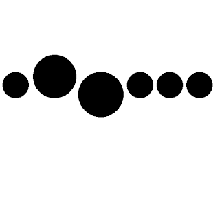
 **When talking to Professor Bill I realized the general emotional aspects and attitude my art had. Off-center shows more excitement or loose-ness, where as centered and structured protrays a stable and firm attitude; Something that I had not thought about before. After we were done conversing I took a step back and examined a few pieces. What caught my eye was one panel in particular (top left corner of "16" and also represented to the right). As you can see the circles stay on at least one guildline and fall into an organized line. However there are two circles that follow lines but are not contained by them. This I think made perfect representation of me. I like the approval of others but will venture off and do my own quirky little things knowing that it does not fit "the norm." Though I do play by most rules, I do not like to conform. Also, the circles are slightly higher than the center. Another small detail that shows my personality through art.
 My top 4
These are my picks because I think they are the "purest" representation of each element out of my selection
Proximity has ALOT of drama. I absolutely love how there is so much tension, not amongst the dots, but rather the cluster and the huge white emptiness. In this piece the negitive space is equally as, if not more, important than the positive space.
Closure could use a little tweaking but aside from that this is my favorite piece. My goal in this is for the viewer to essentially "figure it out."
Simularity. I believe this one is the least "tainted" of all the panels that fall in this catagory. And not only that, I personally find it very pleasing to the eye.
Directional is the best representative that I could find. It's a bit in-the-box but it is very pure in that element.


don't forget i need a write up of your groups critique for your work. Look forward to reading it.
ReplyDeleteyour write up is very good. the self reflection about the work relative to you is insightful and very often what most art is really about.
ReplyDelete